6. Running Ensembles
6.1 Running OSPREI
 Lastly, we will demonstrate running ensembles with OSPREI. These are initiated by simply changing the number of runs (nRuns) in the input file and creating a .ens file with a list of parameters to vary and their ranges. The name should match that of the input file, so 20210923.ens sets up the ensemble for our demonstration. Open this file, you will see a list of variable names that match the exact form of the input file. Anything listed will be varied, with all parameters varying simultaneously. The ensemble values are chosen randomly from a Gaussian distribution centered at the seed value. The width is set by the values in the .ens file (σ = 1/3 the provided value so 99.7% of random values should fall within ± that range).
We have nRuns to 50. For real ensemble studies should probably use 100-200 members, particularly if a lot of parameters are simultaneously varied, but 50 is sufficient for this demonstration. If you are particularly impatient running only 10 should work but the figures will not look quite as nice. Run OSPREI with testRun7.txt (yes, we skipped 6). It will recognize which inputs are being varied, then the ForeCAT components will all run, then it will do the IP portion. It should take between 30 sec and 2 mins per ensemble member, in general, depending how OSPREI is configured and the computer it is run on. The ensemble parameters are randomly generated, but we seed the random number generator at the start of OSPREI (line 43 in OSPREI.py) for reproducibility. It may be convenient to use the date of the eruption as a generating number that is easy to remember for each case. ANTEATR is printing information as each CME undergoes the interplanetary portion, this can be turned off by switching allSilent to True in line 46 of OSPREI.py.
This example is the same CME as the previous test runs, the CME-driven sheath is turned on, and we have provided a .sats files to with the trajectory and observations for the four different satellites. This will highlight all the fancy analysis OSPREI can automatically generate for multi-spacecraft, ensemble simulations.
6.2 Metrics
Run processOSPREI.py, it will take much longer than before as we now generate more figures with the ensemble results and the previous figures have become more complicated. Before jumping into the visualizations we explore the multi-spacecraft, ensemble metrics. In an ideal world with a physically perfect simulation we would expect the same ensemble member to be the best fit at each satellite. This is not the case in our reality, so we typically get a different best fit for each satellite. Indeed, in this case we find a different best fit at each satellite.
It prints information to the screen similar to before, starting with the unweighted errors for each satellite, then the average unweighted errors, and average weighted errorsx (showing only Bepi as an example)
----------------------- Sat: bep -----------------------
0 11.426 29.109 12.531 16.776   12.461 3.610 20.253 23.155   10.735 46.109 7.383 12.522
1 9.398 27.852 10.085 18.347   8.174 5.023 8.050 22.458   10.215 43.071 11.441 15.607
2 14.377 31.379 16.298 14.959   16.180 2.991 20.486 20.857   13.175 50.304 13.506 11.026
3 12.673 31.772 14.328 18.714   9.737 4.297 13.814 21.064   14.386 47.800 14.628 17.343
4 17.122 13.335 16.490 18.715   13.632 3.283 20.725 23.642   19.915 21.376 13.102 14.773
5 15.937 25.125 19.494 28.670   11.451 5.398 20.142 24.624   19.200 39.472 19.023 31.613
6 16.936 24.027 14.907 17.931   12.466 4.471 10.093 20.652   19.915 37.064 18.117 16.116
7 16.782 23.004 22.521 14.854   13.261 8.732 20.502 14.600   19.129 32.519 23.867 15.024

			---- skipping lines ----

Average Errors (Full/Sheath/Flux Rope, B/Bx/By/Bz/n/v/T):
13.198 26.859 14.838 17.600 9999.000 9999.000 9999.000 11.027 6.185 16.338 21.875 9999.000 9999.000 9999.000 14.636 40.545 13.676 14.743 9999.000 9999.000 9999.000

Average Weighted Errors:
0.347 1.668 0.725 0.859 9999.000 9999.000 9999.000 0.385 1.024 0.797 1.498 9999.000 9999.000 9999.000 0.330 1.777 0.669 0.603 9999.000 9999.000 9999.000

Seed has total score of  3.792002775489284
Best total score of  3.12080156310353 for ensemble member  16
You can now see that we now have different total scores for the seed and the best fit member, unlike in the single run case. Each satellite has it's own set of metrics, you may notice on other satellites some lines that only contain a single set of metrics instead of all three. This is when an impact doesn't form a sheath so we only show the FR values. Below this we have a new section, which combines the information from all satellites into a single value for each ensemble member.
Total score over all satellites:
   0    23.60     3.79    5.93    6.74    7.14
   1    22.96     3.69    6.09    6.73    6.45
   2    23.76     4.23    6.08    6.90    6.54
   3    24.44     4.11    6.50    6.81    7.03
   4    27.13     3.46    7.89    8.24    7.53
   5    Fail      4.55    Fail  204.55  202.62

   ---- skipping lines ----

Best total score over all satellites:  21.36 for run number  21
4 members with a score within 10 percent of range (0.65) of min score
   members: 6 15 21 46
The top part shows the ensemble member number, the total score (a sum of the individual satellite values), then the value for each individual satellite. Not all ensemble members are guaranteed to correspond to impacts at all satellites, in these cases the score is labelled as "fail" for both that satellite and the overal score. Below the list we identify the overall best score and corresponding ensemble member. Our score metric is somewhat arbitrary so we also include any other members that have a similar score. This is defined starting at line 885 in proMetrics.py, and right now it shows anything within 10% of the total range (ignoring outliers for misses) of the best fit. In this example, we see that there are three other members with nearly as good of a fit as the best ensemble member. We note that the metrics are both printed to screen but also saved in metrics20210923testRun7SAT.dat files for each satellite, as well as a combined overall metric file.
Below these metrics is additional information showing the mean, standard deviation, minimum, and maximum of various properties at each satellite.
|------------------------ sol ------------------------|
Number of hits:  47
                Mean        STD        Min        Max
CMElat        -25.418      3.866    -34.099    -18.667
CMElon        338.043      3.048    330.142    344.497
CMEtilt        82.611      7.487     71.001    102.446
CMEAW          38.975      1.877     35.487     43.328
CMEAWp         24.290      2.900     13.725     30.525
CMEdelAx        0.270      0.085      0.183      0.803
CMEdelCS        0.385      0.098      0.233      0.929
CMEvF         334.565     36.740    230.374    397.557
CMEvExp        13.967     16.798    -17.853     85.766
TT              1.534      0.060      1.423      1.673
Dur            19.670      4.545      6.288     28.368
n              50.041      9.430     31.840     78.618
logT            4.287      0.102      4.074      4.528
B              24.971      6.086      9.356     38.420
Bz             -4.774      1.846     -9.206     -1.641
Kp              3.557      0.384      2.717      4.232
The first three of these shouldn't change much between different satellites because the CME lat, lon, and tilt do not vary with interplanetary distance in OSPREI. There may be small variations due to non-impacting cases being excluded at different satellites. The remaining parameters should vary more, particularly if the satellites are scattered significantly in radial distance, such as this case.
6.3 Visualizations
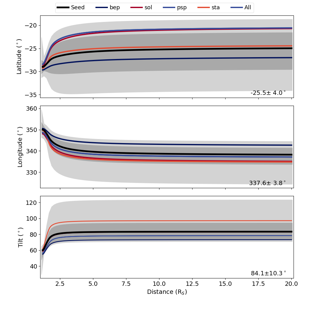 We have the same CPA, ANTPUP, DragLess, and IS figures as before, but they all contain ensemble information. We note that the J map figures still show the seed result and are unchanged from the single run case. The other figures have the same format as before, but with more details. Using the CPA plot as an example, the black line show the ensemble seed, which is the same result as the single run case. We also have a dark gray shaded region showing the core of the distribution (one standard deviation about the mean), and a lighter gray shaded region showing the full range of the ensemble. We also highlight each of the profiles corresponding to the individual satellite best fits and the overall best fit. The legend at the top shows the color for each of these. In our example, the same ensemble member is the best fit for Parker Solar Probe and the overall fit so these are the same color/a single profile. The IS plot shows the seed profile in red and each other ensemble member in light gray. The ANTPUP, DragLess, and IS figure shows things in an analogous format using distinct colors for individual best fit profiles and darker/lighter shading for the core/full range of the ensemble results. If you would prefer different colors for the highlighted cases this can be set in BFcols and comboCol in lines 59 and 61 of processOSPREI.py.
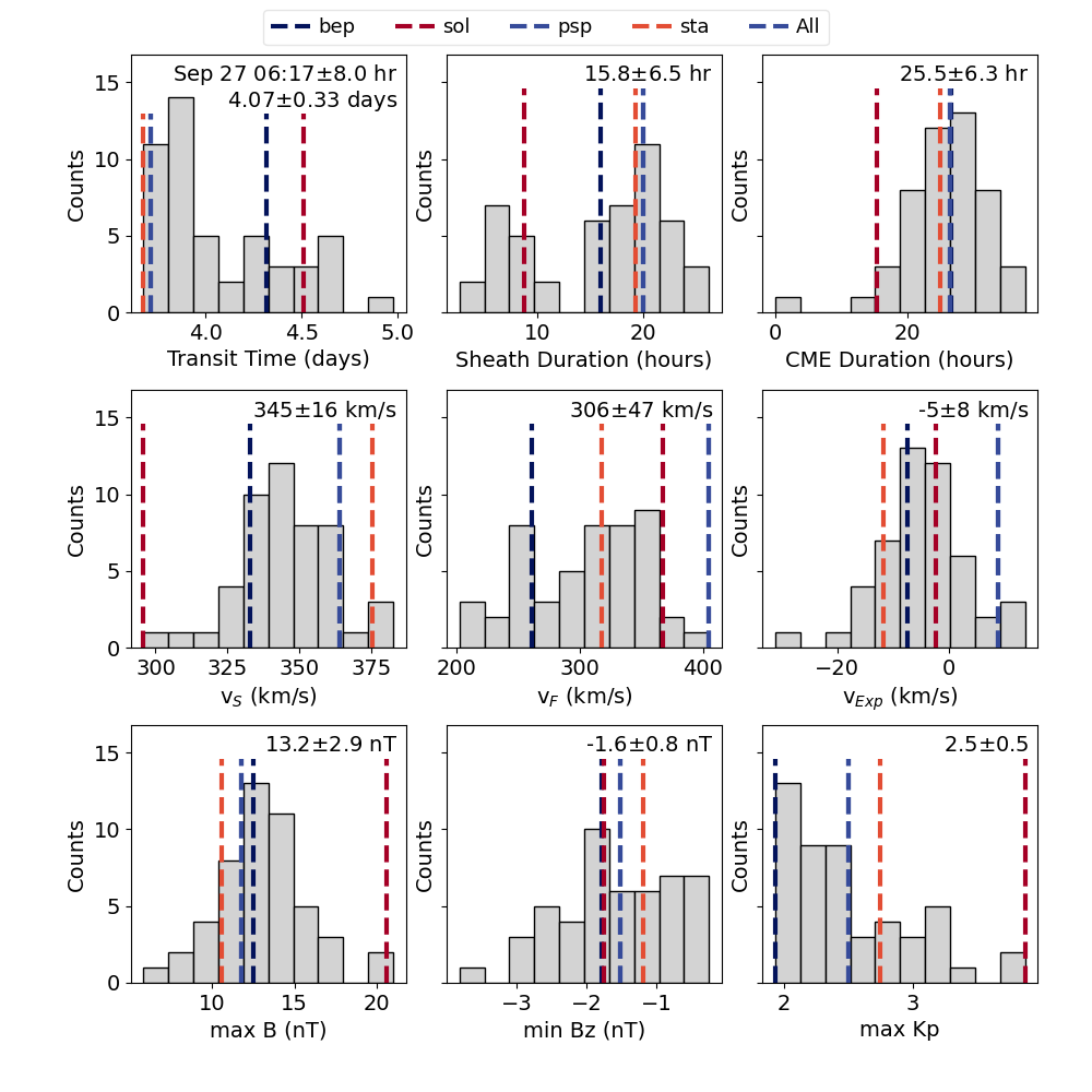 We also have five new types of figures, tagged as ANThist, allIShist, allPerc, ENS, and PercMap. Most of these will make one figure for each satellite. The hist figures are all histograms for the results from various components of OSPREI and should be relatively self explanatory. The colored dashed lines show the values for each of the ensemble members. There is a significant amount of overlap between the ANT/allIS figures. In general, allIS should be the most useful (left shows allIS for STEREO-A). The ANT figure uses results from ANTEATR, and makes estimates about the magnetic field and Kp that would be observed. This is a bit of a leftover from when ANTEATR and FIDO ran in series, rather than simultaneously, but it is still useful if FIDO is not run for some reason. The allIS histogram uses the results from FIDO, so the values are actually simulated rather than estimates. allIS includes information about both the sheath and flux rope. If we do not include the CME-driven sheath then the allIS figure will be replace with a FIDOhist figure.
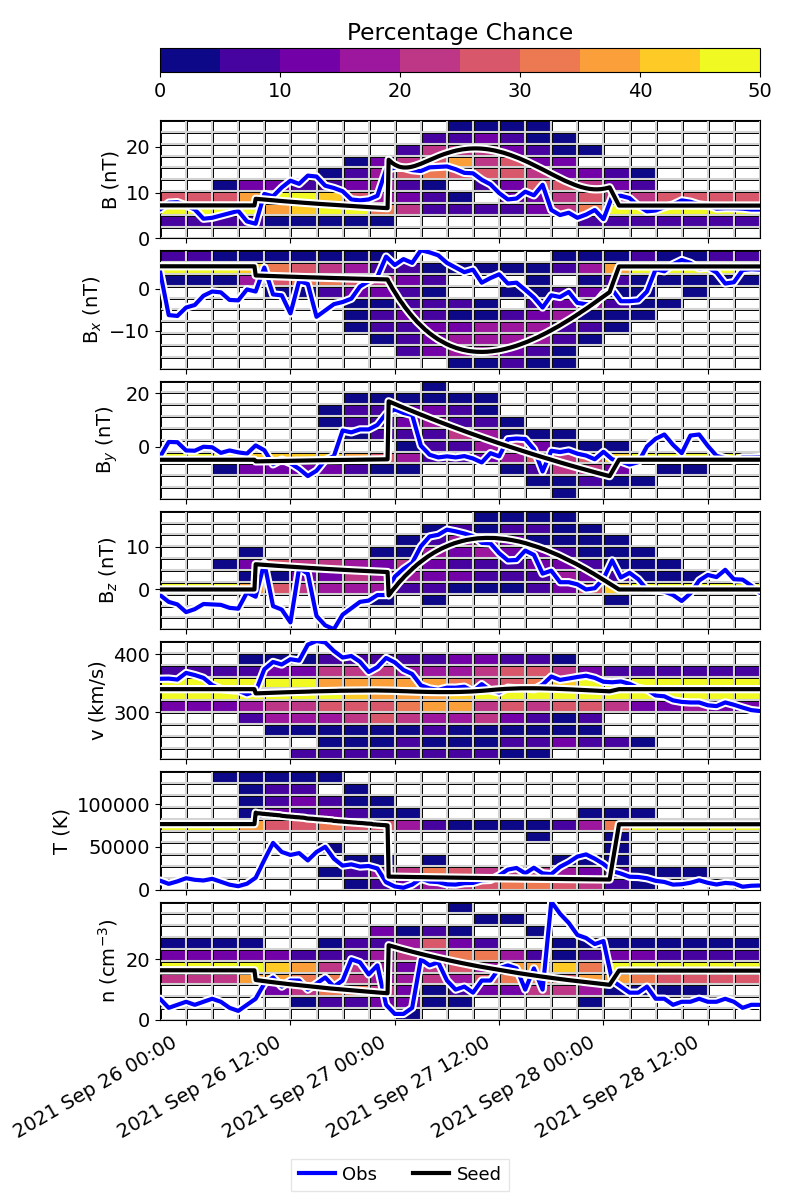 The allPerc figure is analogous to the in situ profile, but instead of showing individual profiles, it maps time and parameter space onto a 2D grid and calculates percentages (example shown for Parker Solar Probe). The figure will look less “filled in” if a smaller ensemble size was used. The blue line shows the observations and the black line shows the ensemble seed.
This visualizes the results as a sort of heat map of the most probable values over time. This should be a quick way of visualizing the importance of an event. For larger sample sizes, the gray individual profiles become saturated in the figure and it can become difficult to distinguish between the individual profiles. We have chosen not to include the individual best fits in these figures as it becomes too cluttered, but it is possible to include them (see syntax in line 338 of processOSPREI.py).
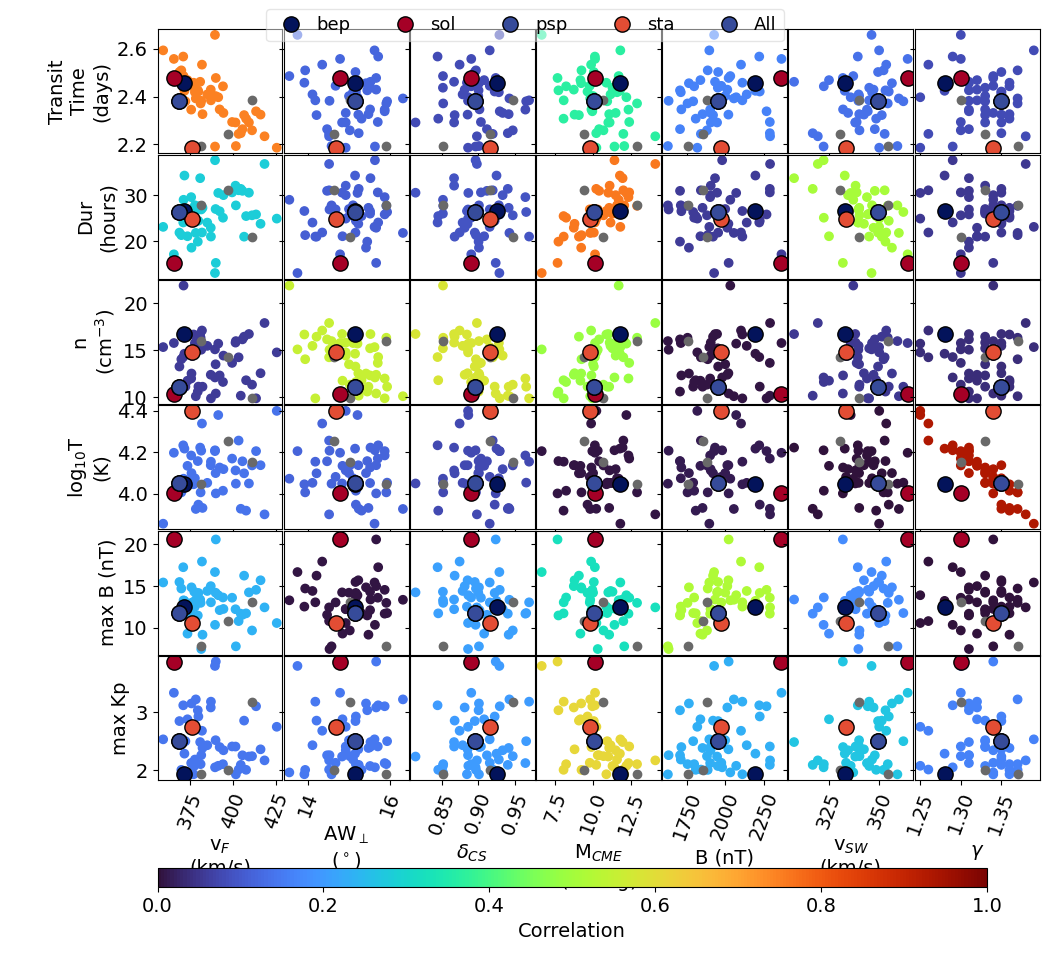 The ENS figure determines shows the correlation between variation in the OSPREI inputs and outputs (shown for STEREO A). It determines which pairs are correlated above some critical value (set in the call to makeEnsplot in processOSPREI.py). It selects every input and output that produces a correlation above the critical value, then creates a grid of scatter plots between each of these inputs and outputs. The inputs are along the x-axis and the outputs along the y-axis. Each panel is colored by the correlation coefficient of that pair of input and output, which should highlight the important correlations.
The default critical correlation is set to 0.5, whether or not this is an appropriate value depends on the size of the ensemble. If the value is too low then practically every parameter will be included and the figure becomes unmanageable. With a higher number of ensemble members or increasing the critical value the algorithm will be more selective and produce a less overwhelming figure. The best fit members are shown again in their individual colors and with larger dots. We also show any of the near best fit (for that satellite) members as light gray.
 The figure can be useful for identifying outliers and comparing the properties of the different best fit members. For example, we see that the Solar Orbiter best fit (red dot) lives in a fairly different region of parameter space than the other best fits. We can see that the difference is largely driven by extreme values in both B and the solar wind velocity for this case.
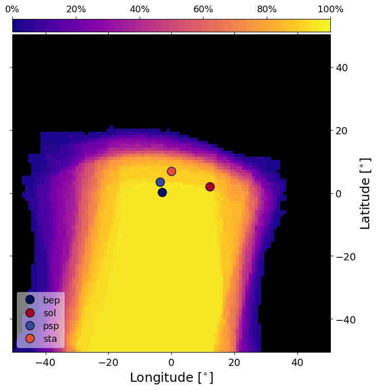
The final new figure is the PercMap figure (shown for STEREO A). This shows contours of the percentage chance of CME impact from the perspective of the satellite looking back toward the Sun. For each CME, we take the 2D projection onto latitude and longitude and determine various properties and determine up the percentage of ensemble members within each grid cell. The locations of the individual satellites are superimposed on top of the percentage map. This figure is produce for each satellite with the satellite of interest centered within the frame. The actual contour map does vary between satellites due to some evolution in the CME size with distance.